Coffee Time: Crafting a Fast, Habit-Forming Coffee Ordering & Rewards Interface
“Great interface design doesn't just look warm; it removes cognitive load through systematic precision.”
Project Brief
Coffee Time is a dual-purpose mobile ordering and in-store loyalty application designed for daily coffee commuters. This case study focuses on the interface engineering behind the product: how a 6-tier Figma Variable architecture, stateful atomic components, and a streamlined 3-step customization flow come together in a high-contrast dark theme.
- Role
- Senior UI Designer
- System
- 6-Tier Figma Variable Architecture
- Core Flow
- Streamlined 3-Tap Ordering
- Theme
- Adaptive Dark & Light Mode Tokens
02 / The UI Challenge
Why most food & beverage interfaces fail the morning rush.
Daily coffee ordering happens when users are half-awake and in a hurry. Most delivery apps overwhelm the screen with competing promo banners, inconsistent card densities, and deep nested menus. The interface challenge for Coffee Time was clear: strip away visual noise and engineer a tactile, high-contrast dark interface that guides the thumb from craving to checkout in three taps.
Tactile Contrast
Using deep espresso surfaces (#0F0F0F) so beverage photography and primary actions (#EE5148) command instant visual hierarchy.
Thumb-Zone Ergonomics
Placing primary customization toggles, quantity steppers, and cart triggers strictly within natural one-handed reach.
Tokenized Scalability
Building every colour, radius, and typographic scale on multi-tier Figma Variables for zero-friction developer handoff.
03 / 6-Tier Figma Variable Architecture
Architecting a scalable, developer-ready Design System.
Rather than picking ad-hoc hex codes on the canvas, Coffee Time is powered by a 6-collection Figma Variable architecture. Separating raw values from semantic intent allows the entire interface to switch seamlessly between Dark and Light modes without detaching a single component.
- 1. Primitives
- 2. Semantic Collection
- 3. Style Tokens
- 4. Typo Primitives
- 5. Typography Tokens
- 6. Size Tokens
Red Orange ramp
50
#FDEDEC
100
#FCDAD9
200
#F8B7B5
300
#F4938F
400
#F1716B
500
#EE5148
600
#E0301E
700
#A82317
800
#70160E
900
#380906
950
#1C0302
Greyscale elevation
950
#0F0F0F
900
#171717
800
#292929
Semantic mapping
- Surface / default→ Greyscale/950
- Border / subtle→ Greyscale/800
- Text / primary→ Primary
- Action / primary→ RedOrange/500
- Status / success · alert→ Success · Alert
04 / Atomic Component Engineering
Component library engineered for state clarity.
Every interactive component was stress-tested across default, active, disabled, and loading states to ensure visual consistency across the ordering journey.
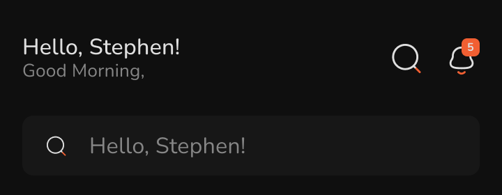
Stateful Navigation & Contextual Header
UI Annotation · Combines a personalized time-of-day greeting with a high-contrast notification badge ('5' in #EE5148) and a dark-surface search bar (#171717) to keep top-level navigation calm and scannable.
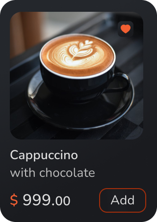
High-Density Product Card
UI Annotation · Engineered on a #171717 surface with a top-right liked heart toggle, clear typographic hierarchy separating the beverage title from the '$ 999.00' price tag (using #EE5148 for the currency symbol), and a thumb-friendly outlined 'Add' pill button.
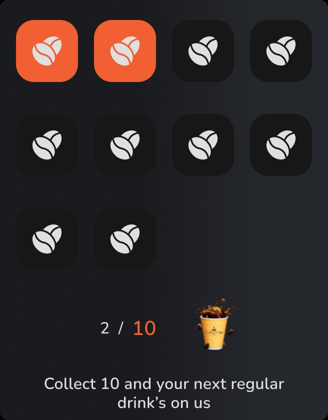
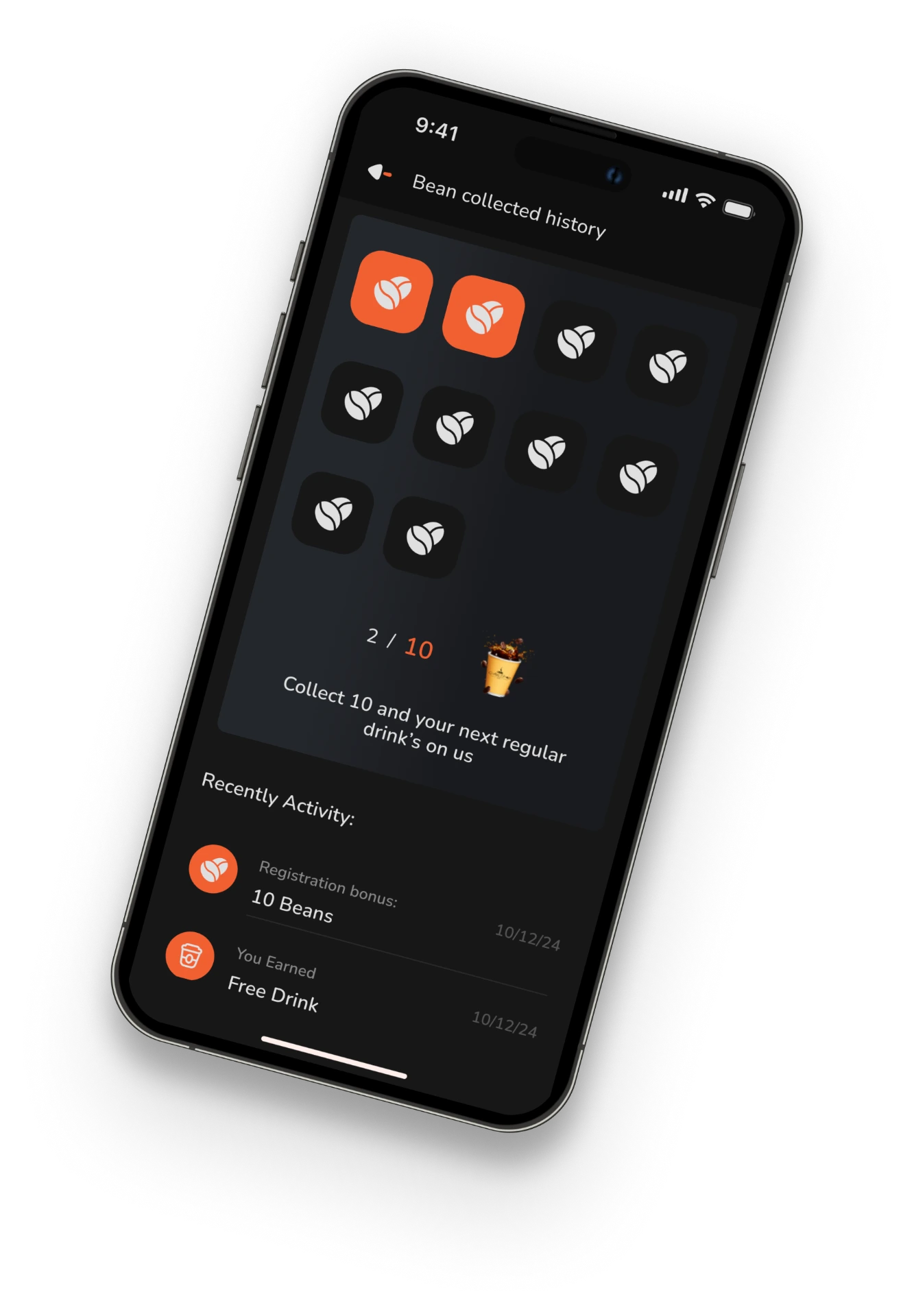
Gamified 10-Bean Loyalty Tracker
UI Annotation · Visualizes reward progress through a 10-slot tactile grid where active earned beans glow in #EE5148 against recessed dark slots, paired with a '2 / 10' counter to drive repeat ordering habits.
05 / The 3-Tap Ordering Flow
Turning system tokens into a calm, tactile product experience.
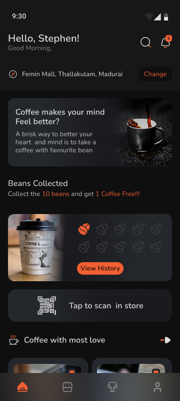 Screen 01
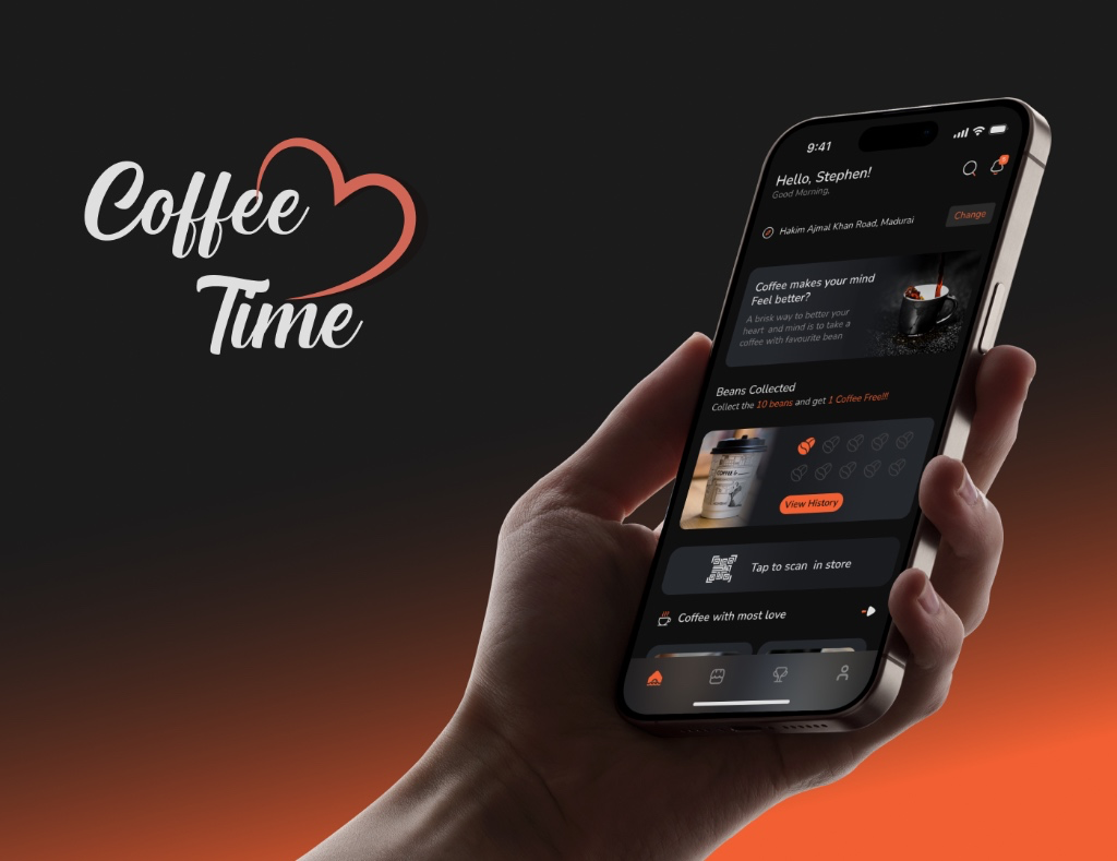
Focused Discovery & In-Store QR Access
Key UI Details · Surfaces live store location with a quick 'Change' action, an embedded 'Beans Collected' loyalty card with a 'View History' CTA, a one-tap 'Tap to scan in store' QR bar, and a glowing active state on the bottom navigation bar.
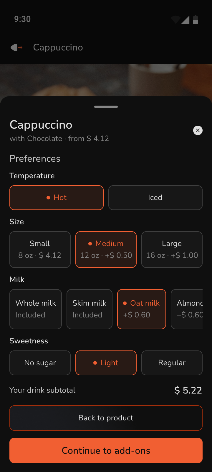 Screen 02
Tactile Customization Sheet
Key UI Details · Replaces clunky dropdown menus with single-tap selection chips for Temperature (Hot/Iced), Size (Small/Medium/Large with live +$0.50 pricing deltas), Milk (Oat milk +$0.60), and Sweetness (Light). Active selections use a warm dark-orange fill (#380906), #EE5148 border, and an orange indicator dot above a live drink subtotal ($ 5.22).
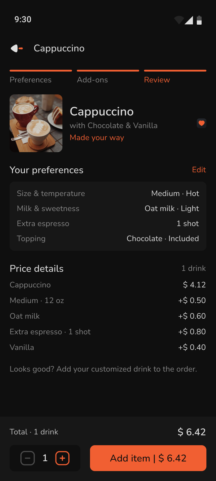 Screen 03
Step-Tracked Order Review & Checkout
Key UI Details · Uses a 3-segment top progress bar (Preferences → Add-ons → Review) to eliminate checkout uncertainty. Pairs a grouped 'Your preferences' card (with instant 'Edit' access) and itemized 'Price details' above a sticky bottom action bar featuring quantity steppers (- 1 +) and a high-contrast 'Add item | $ 6.42' primary CTA.
06 / Design Reflection
Why systematic UI matters.
Tokens bridge design and engineering
Multi-tier variables eliminate handoff guesswork and make theme switching effortless.
Dark mode requires intentional elevation
Using subtle surface steps (#0F0F0F to #171717 to #292929) creates depth without heavy drop shadows.
Speed is a visual hierarchy problem
Reducing visual noise directly accelerates the 3-tap ordering habit.
Want to inspect the 6-tier variable collections and component properties up close?
Explore the complete primitives, semantic tokens, dark/light style modes, and auto-layout component matrix directly in Figma.
Open Live File in Figma