PayNora
Confidence-first digital payments for senior citizens.
Designed through behavioral research to reduce payment anxiety, improve independence, and build trust for older adults.
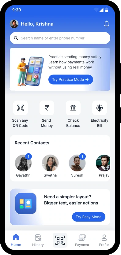
PayNora was built collaboratively. Within the team I led the research and synthesis track: running interviews and translating observations into insights. I carried those insights through interaction design, UI, prototyping and validation.
Older adults struggle with digital payments because of fear, not technology.
The hesitation isn't about capability. It's the worry of making an irreversible mistake.
“Confidence, not features, decides whether older adults pay on their own.”
Understanding confidence before designing for it.
Before designing a single screen, the work began with listening to how older adults actually pay, worry and decide. Emotion, not interface, turned out to be what determined whether someone paid on their own.
We grounded our decisions in real conversations, contextual observations and moderated interviews to understand how senior citizens experience digital services.
Six one-to-one conversations with adults aged 55–72, held in their own homes so the setting stayed familiar.
Watching real payments happen at the dining table and the shop counter, including the pauses before confirming.
Hesitation before the final tap, double-checking amounts aloud, calling a family member “just to be safe”.
“Walk me through the last payment you made.” · “What worries you most before confirming?” · “When do you ask for help?”
Interview transcripts clustered into affinity groups, then distilled into an empathy synthesis.
Different people.
One behavioral pattern.
Across multiple interviews, one consistent pattern emerged. Regardless of age, background or digital confidence, participants wanted products that respected their independence instead of assuming their limitations.
One of the participants whose experiences reflected the broader behavioral pattern observed during the research.
“I can manage — just don't talk down to me.”
Across multiple participant interviews, respectful guidance, transparent communication and confidence-building interactions consistently emerged as stronger needs than simplified or overly directive experiences.
This recurring behavioral pattern directly influenced the introduction of confidence-building interactions, transparent explanations and supportive decision-making throughout the product experience.
Observations from the conversations were mapped into what she said, thought, did and felt, the bridge between listening and designing.
“I can manage — just don’t talk down to me.”
“What if I send it to the wrong person and can’t get it back?”
Re-reads the amount aloud, waits, sometimes calls a family member before confirming.
Capable, but exposed — one wrong tap away from embarrassment.
Research artifact — empathy synthesis illustrating how participant observations were translated into design decisions.
What behavioral research revealed.
The strongest signals pointed to emotion, trust, and reassurance, long before interface details mattered.
Users feared making irreversible mistakes.
Many depended on family members for payments.
Trust mattered more than speed.
Simple guidance reduced hesitation.
Finding patterns behind individual stories.
Rather than treating every interview independently, observations were clustered into recurring behavioral themes. This helped distinguish isolated opinions from consistent patterns that shaped the product direction.
Participants hesitated whenever actions felt permanent or difficult to recover.
People wanted confirmation and guidance before making important decisions.
Users consistently valued clarity and confidence over completing tasks quickly.
Participants often relied on trusted family members before taking action independently.
Participants wanted products that empowered them instead of making them feel incapable.
Research artifact — affinity mapping used to synthesize interview observations into recurring behavioral themes.
Reframing the challenge through research.
The initial problem focused on digital accessibility. Research revealed that confidence, trust and fear of irreversible mistakes were the deeper barriers.
How might we help senior citizens remain independent as essential services become increasingly digital without making the experience overwhelming?
- Fear of irreversible mistakes
- Need for reassurance before taking action
- Trust mattered more than speed
- Confidence was built through clarity, not simplification
How might we make high-risk digital decisions feel safe, understandable and reversible so senior citizens can act independently with confidence?
Design a digital experience that reduces anxiety, builds confidence and enables senior citizens to complete important tasks independently while preserving their dignity.
Four principles guiding every product decision.
Prioritizing features that solve real behavioral needs.
Each feature directly addresses a recurring behavioral pattern identified during research rather than adding functionality for its own sake.
Reduces complexity without reducing autonomy.
Allows users to build confidence before performing real tasks.
Creates trust by preventing irreversible mistakes.
Provides reassurance while preserving user independence.
A Double Diamond approach.
Diverging to understand, then converging to decide, twice.
Explore the problem space through behavioral research.
Synthesize insights into a clear, focused problem.
Explore solutions that build payment confidence.
Refine, test, and converge on what works.
Turning research into product decisions.
Rather than designing screens immediately, the solution evolved through multiple stages, from organising information, validating task flows, simplifying interactions and refining visual hierarchy before arriving at the final experience.
Content and actions were organised so older adults could always tell where they were, and what came next.
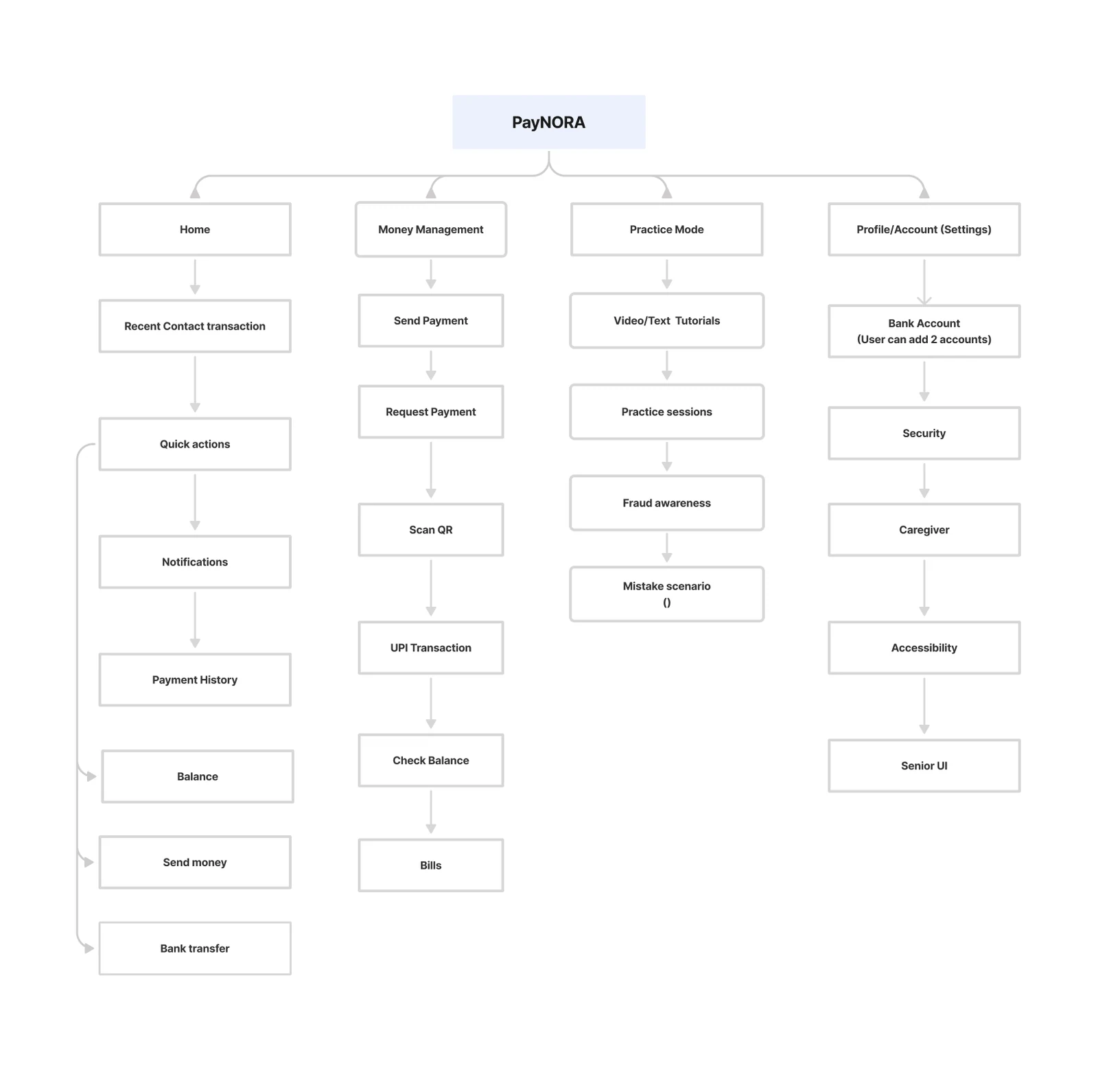
The flow removed dead ends and surfaced reassurance at every decision point, shaping the sequence the final interface would follow.
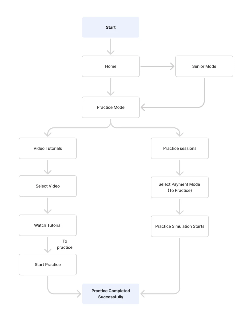
Fast frames pressure-tested layout and hierarchy without visual detail, letting flow and clarity lead the decisions.
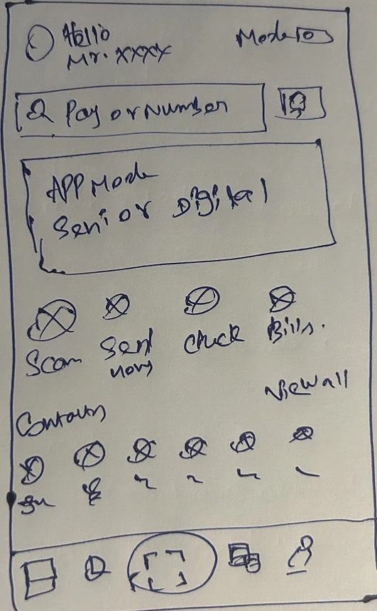
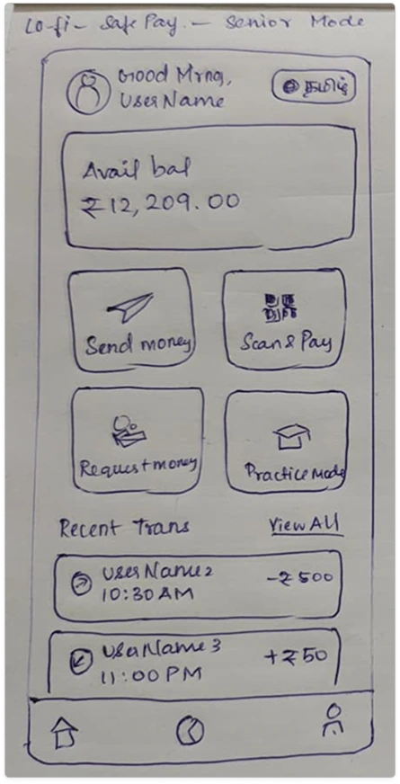
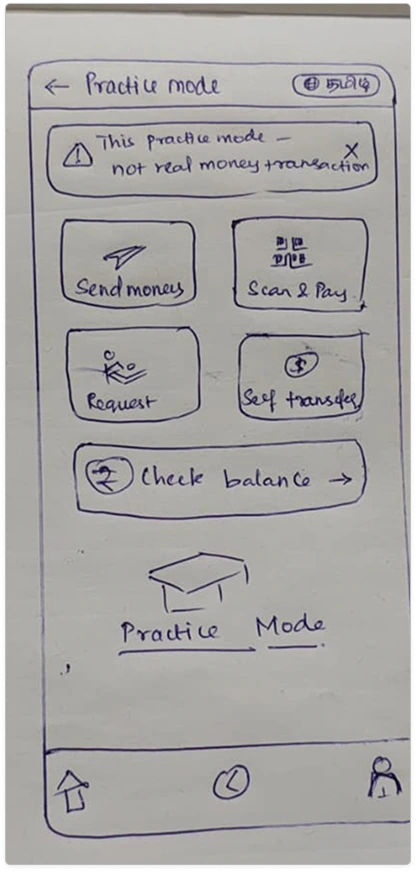
Proportion, density and content order were refined, bridging rough sketches and the final high-fidelity interface.
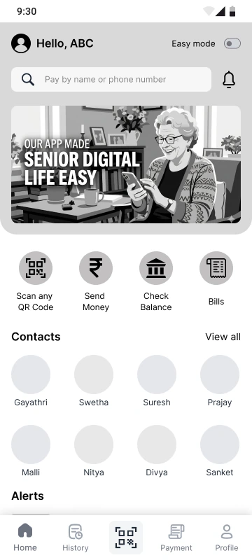
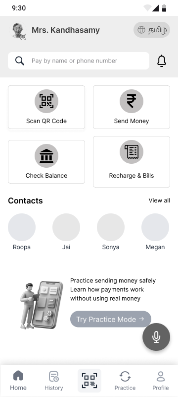
Early directions narrowed many possibilities into a single, deliberate decision, each weighed on its own terms.
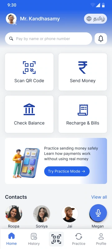
A first pass exploring tone, type and component styling.
A second route testing layout density and emphasis.
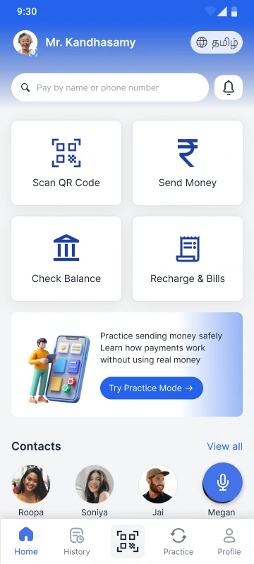
The calm, confident system that carried into high fidelity.
Designing confidence into every interaction.
The final interface reflects everything gathered through research, usability testing and iterative refinement: calm layouts, clear actions, and a payment flow that never leaves an older adult guessing.
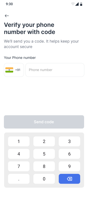
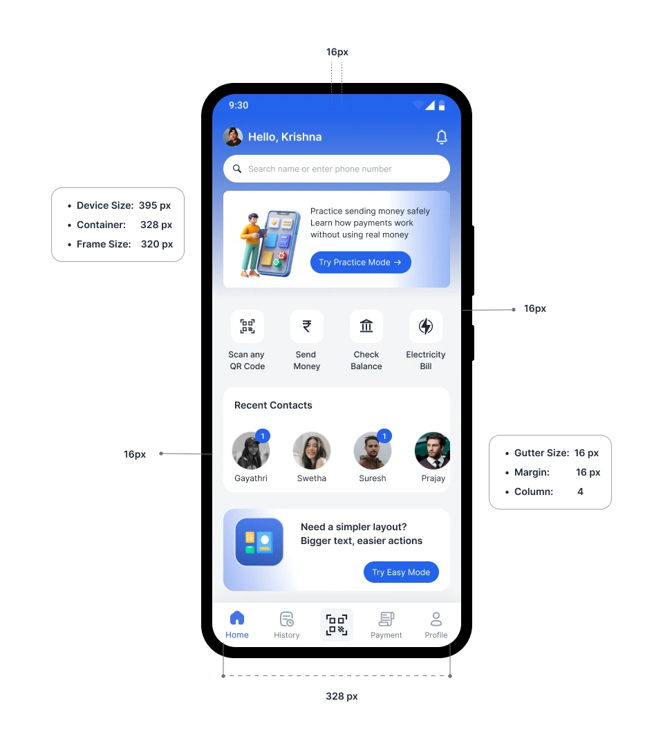
A calm, familiar way in.
Signing in and landing home feels unhurried and recognisable, setting a confident tone before anything else happens.
The heart of PayNora.
Senior Mode, Practice Mode, fraud awareness and caregiver alerts work together to replace anxiety with reassurance, the features that make PayNora uniquely confidence-first.
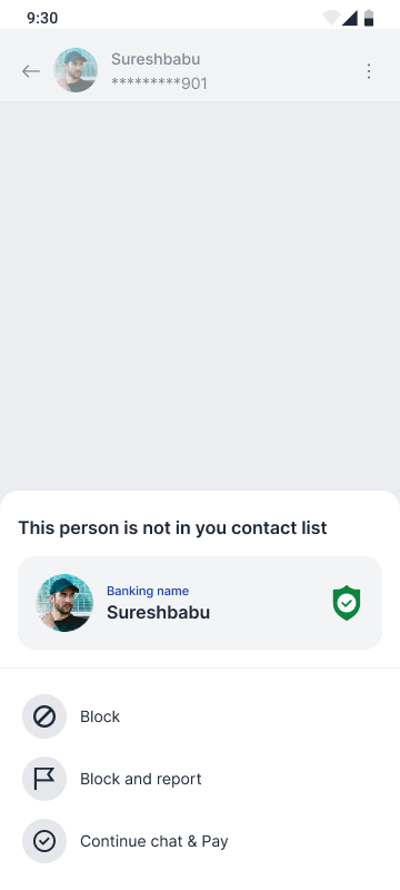
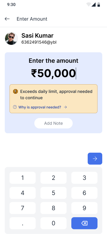
A single, unhurried path to pay.
From scanning to confirmation, the payment journey keeps every step plain, visible and reversible, so the moment of paying never feels risky.
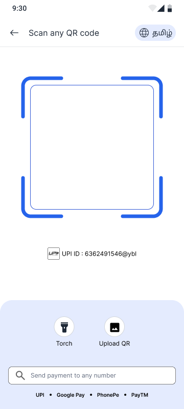
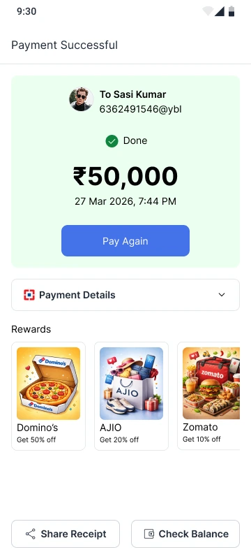
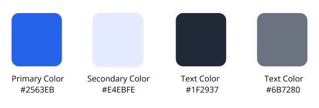
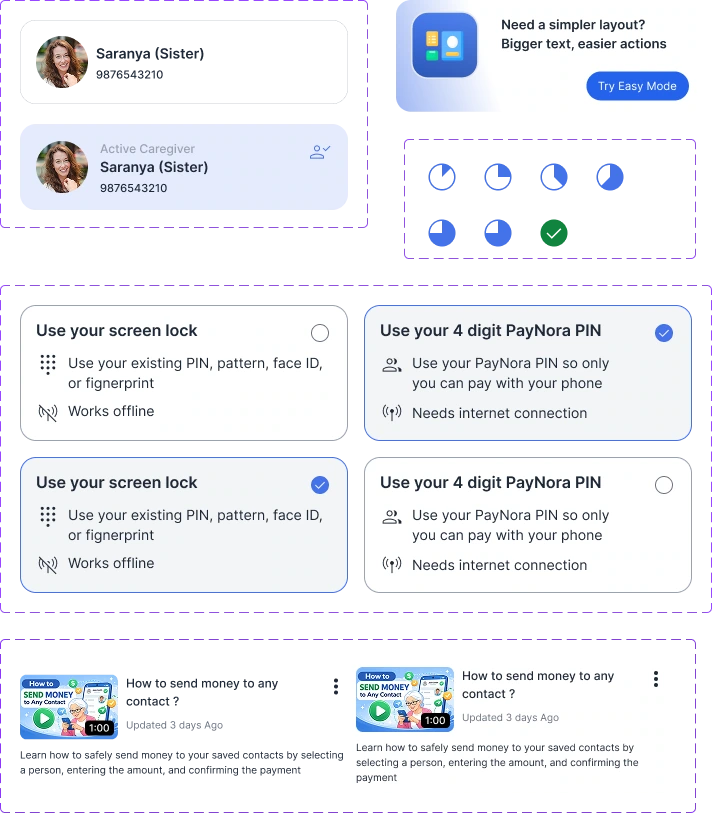
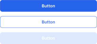
One consistent language across every screen.
A shared system of type, color and components keeps the experience predictable, familiarity that quietly builds confidence and independence for senior citizens.


Validating the critical journeys.
The prototype was created to validate critical user journeys before any production implementation.
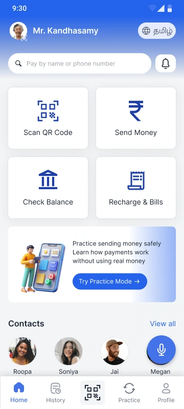
A calmer, larger interface that reduces effort and hesitation.
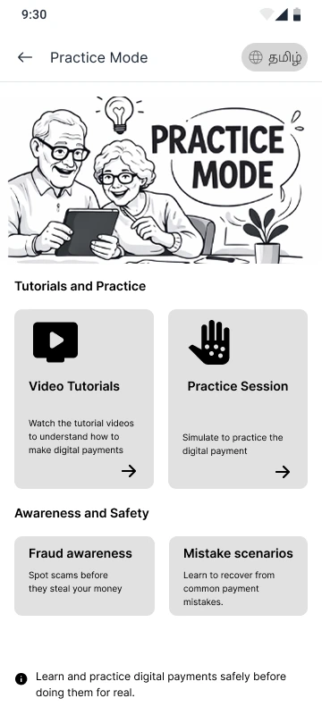
Risk-free rehearsal of real payments, with no money involved.
Timely, plain-spoken warnings that help spot scams before they act.
Watching confidence build, then designing for it.
Moderated sessions exposed where older adults hesitated. Each finding translated directly into a change that made paying feel calmer and more independent.
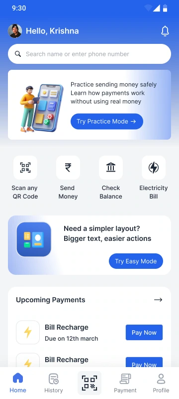
Older adults paused at the standard home screen, unsure which action to take first.
Introduced an Easy Mode with larger type, fewer choices, and clearer primary actions.
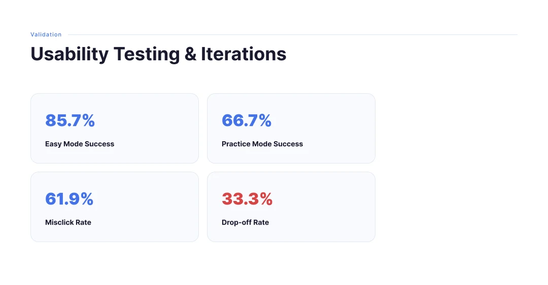
Easy Mode reached an 85.7% task-success rate in testing.
Participant Feedback“Now I can see exactly what I'm supposed to do.”
A 33.3% drop-off appeared when the flow felt unfamiliar or risky.
Surfaced Practice Mode earlier so users could rehearse without real money.
Practice Mode supported a 66.7% completion rate among first-time users.
Participant Feedback“Once I tried it without money, I wasn't scared to do it for real.”
A 61.9% misclick rate revealed cluttered, closely-spaced controls.
Simplified the layout, grouped related actions, and increased spacing between targets.
The redesigned screens reduced accidental taps and hesitation.
Participant Feedback“I felt more confident because I knew exactly what would happen next.”
Refining toward clarity and calm.
Testing reshaped the interface. Each iteration removed friction and noise, moving every screen closer to confident, independent use.
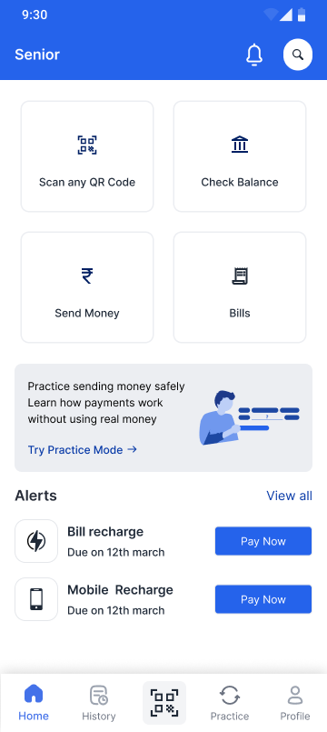
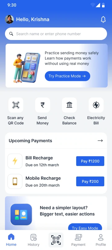
The original home screen crowded equal-weight actions, leaving older adults unsure where to start.
Reduced visible options, prioritised upcoming payments, and added a clear route into a simpler Easy Mode.
A calmer first impression that points to the next confident step.

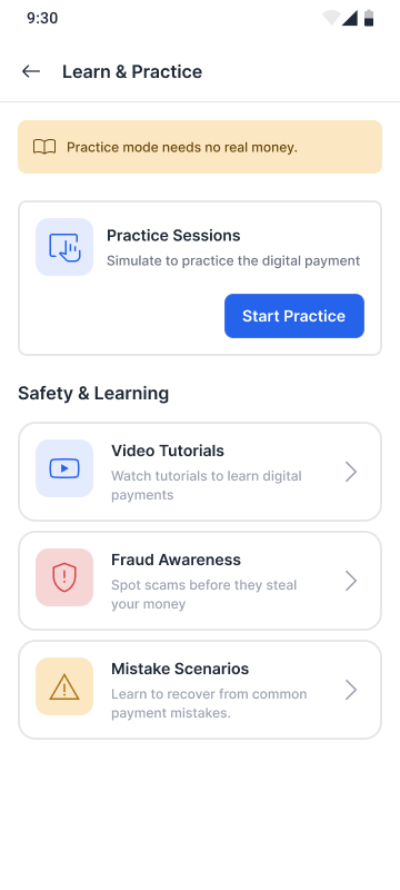
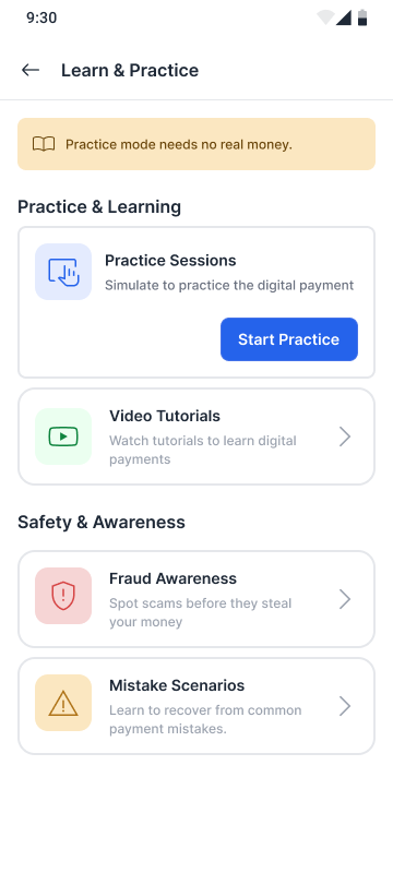
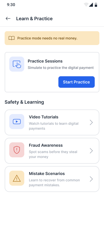
Learning content was dense and mixed, making safe practice feel like another task to decode.
Separated practice from safety, streamlined the cards, and made starting a session the obvious action.
A focused space to rehearse payments without fear of real mistakes.
How success would be measured.
As this is a concept project, these metrics represent directional indicators that would be validated after launch.
Task completion rate
More payments finished independently, without abandoning mid-flow.
Assistance requests
Fewer moments where a family member has to step in and take over.
User confidence score
Self-reported certainty before and after confirming a payment.
Payment abandonment
Drop-off at the confirmation step as a proxy for hesitation.
Trust & perceived safety
How safe the experience feels after fraud warnings appear.
Looking beyond the solution.
This project began as an accessibility challenge but gradually became an exploration of confidence, independence and human dignity in digital experiences.
Research changed the direction more than assumptions.
The brief started as accessibility. The interviews reframed it as fear of irreversible mistakes.
Independence is emotional, not only functional.
People did not want a simpler screen. They wanted to act without asking anyone for help.
Removing fear creates better product experiences.
Every reassurance — a rehearsal, a warning, an undo — did more for adoption than added capability.
Simplicity is built through many iterations.
The calm version of each screen was the fourth one, never the first.
What this project taught me.
Research often changes the problem, not just the solution.
Designing for vulnerable users requires empathy beyond accessibility guidelines.
Trust is built through clear communication more than visual polish.
Every interface decision should reduce uncertainty rather than increase speed.
Small interaction changes can significantly improve confidence.
Where the product could
evolve next.
Potential directions that extend the confidence-first foundation if PayNora continued beyond this concept.
AI-powered fraud explanation before high-risk payments.
Personalized confidence scoring based on digital literacy.
Trusted family collaboration with privacy controls.
Voice-guided payment assistance.
Adaptive interface that evolves with user confidence.
Explore another product story.
Every project explores a different product challenge, but they all share the same design philosophy: building experiences people can trust.
Confidence-Centered Fashion Commerce
Designing trust into fashion purchases through behavioral research.
Shinewoods Platform
Simplifying talent discovery through a scalable platform for talents, recruiters, and agents.
Sureshbabu Shanmugaraj
Senior UI/UX Designer
Crafted with clarity and intention.