Shinewoods
Designing a trust-first talent marketplace for the entertainment industry.
Redesigned an existing casting platform by simplifying onboarding, reducing friction, and improving talent discovery through user research, stakeholder collaboration, and product thinking.
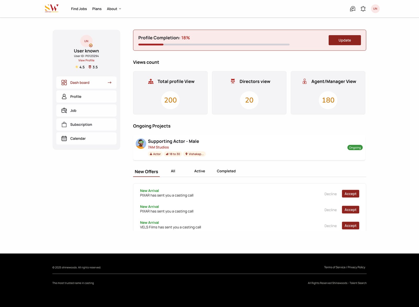
The product already existed. The work was making it better.
Shinewoods came to us with a live casting platform, not a blank canvas. The brief wasn't to invent something new, but to modernize an established experience that was quietly losing the people it was built for.
Beneath a dated interface, the platform struggled to turn interest into action. Talent signed up but rarely completed their profiles, and casting teams found it hard to surface the right people at the right time.
- High onboarding drop-off
- Outdated interface
- Low profile completion
- Difficult talent discovery
- Poor conversion
“Visitors arrived, but too few stayed long enough to become active members.”
Modernizing an experience, alongside the people who knew it best.
I joined the project to modernize the existing experience while collaborating directly with stakeholders and the client, grounding every decision in their domain knowledge and the realities of the platform.
The platform attracted visitors but struggled to convert them into active users.
Long registration flows, fragmented navigation, and inconsistent experiences reduced confidence across multiple user groups.
“Trust, not traffic, was the real barrier to a thriving talent marketplace.”
Understanding the platform before changing it.
Before redesigning the platform, it was essential to understand the existing workflows, business expectations, and real user challenges.
Research wasn't a phase; it was the foundation. Every design decision that followed was grounded in what we learned from stakeholders, users, and the product itself.
A clear picture of the existing experience.
- Client discovery sessions
- Business requirement discussions
- Existing platform review
- Interviews with 3–4 aspiring talents
- Review of existing user feedback
- Observation of onboarding pain points
- Analysis of similar casting and talent platforms
- Review of onboarding patterns
- Recruitment workflow comparison
- Existing information architecture
- Navigation review
- Registration workflow audit
- Conversion pain-point analysis
What we learned, and what it meant for design.
Long onboarding increased user drop-off.
Why it mattered
Every extra step asked users to invest more trust before they understood the value.
Design Response
Break registration into manageable steps with clear progress.
Users wanted to explore opportunities before committing.
Why it mattered
Forcing account creation before browsing created immediate resistance.
Design Response
Allow exploration with progressive profile completion.
Recruiters struggled with incomplete profiles.
Why it mattered
Incomplete profiles made hiring decisions slower and less confident.
Design Response
Guide talent through structured profile building with smart defaults.
Navigation confusion across multiple user roles.
Why it mattered
Talent, recruiters, and agents had different needs but shared the same confusing structure.
Design Response
Create role-based navigation with clear entry points.
Trust and profile completeness directly influenced hiring decisions.
Why it mattered
Without verification signals, recruiters hesitated to engage.
Design Response
Introduce profile verification badges and completeness indicators.
Guiding ideas that shaped every decision.
Reduce Cognitive Load
Simplify complex onboarding into manageable steps.
Build Trust
Increase confidence through profile verification and transparency.
Simplify User Roles
Create focused experiences for Talent, Recruiters, and Agents.
Increase Discoverability
Surface relevant opportunities and information at the right time.
One platform. Three connected experiences.
Before designing interfaces, it was important to understand how different users interact with the platform.
Shinewoods is a multi-sided marketplace, rather than designing a single workflow, the platform was structured around three interconnected user groups, each with unique responsibilities, goals and navigation patterns.
Mapping every role to a clear, navigable structure.
The information architecture organizes the platform's shared services and role-specific journeys into a single, coherent map, giving each user group a focused path without fragmenting the experience.
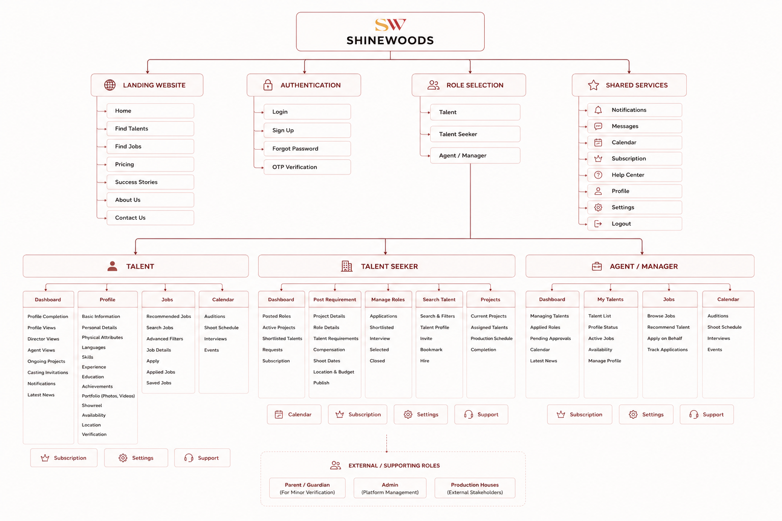
Information Architecture · Click to view full size
Three distinct paths, one connected journey.
A shared onboarding flow branches into role-specific journeys. The map below traces how each user group moves through the platform, while keeping access to common services like notifications, calendar and support.
The primary journey from onboarding to discovering opportunities: signing up, verifying age, completing a profile, and applying to relevant jobs.
How recruiters discover, shortlist and manage talent: posting requirements, searching profiles, and coordinating auditions and shoots.
How agents manage multiple artists and coordinate opportunities: browsing jobs, applying on behalf of talent, and tracking applications.
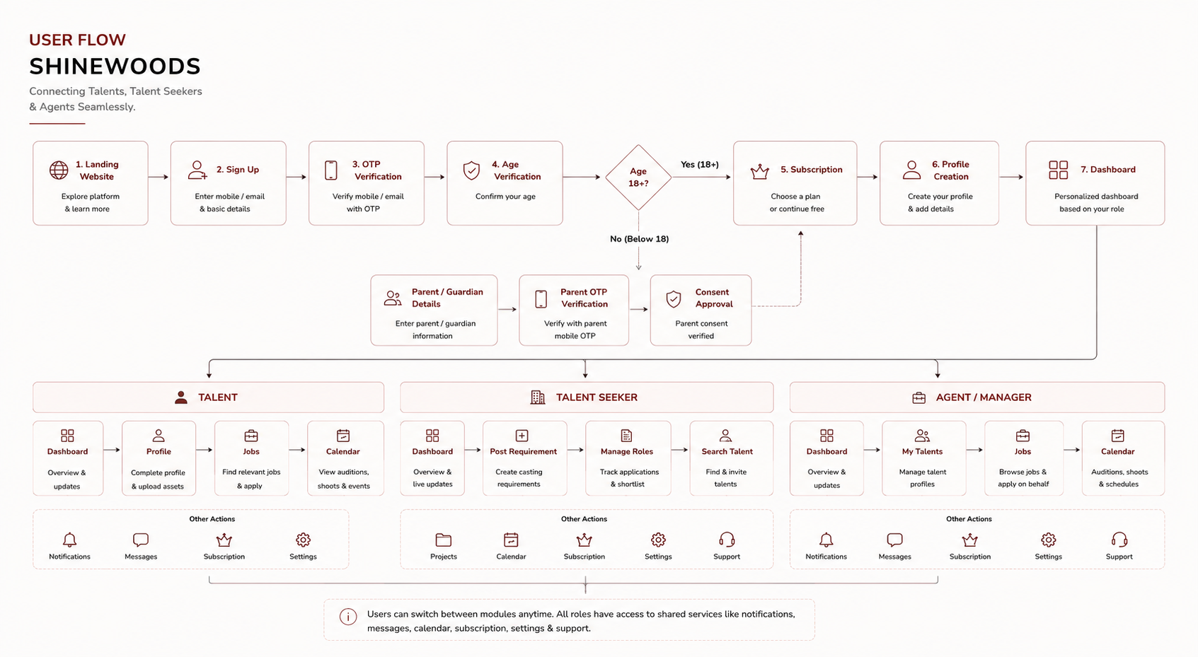
User Flow · Click to view full size
Designing clarity before pixels.
Early concepts explored onboarding, navigation, and role-based workflows before moving into visual design.
Designing a friction-free registration journey through progressive disclosure.
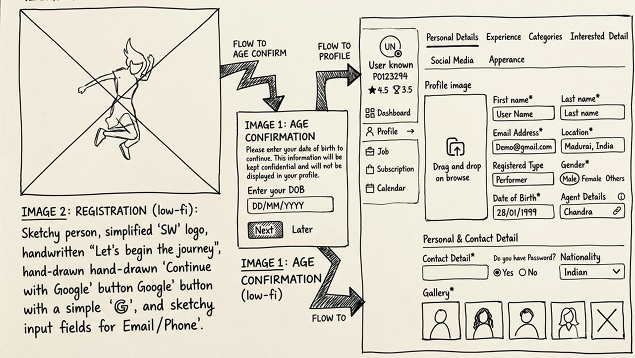
Focused on reducing onboarding friction through progressive disclosure while collecting only the essential information required to begin the user's journey.
Exploring the primary workflow for actors after completing onboarding.
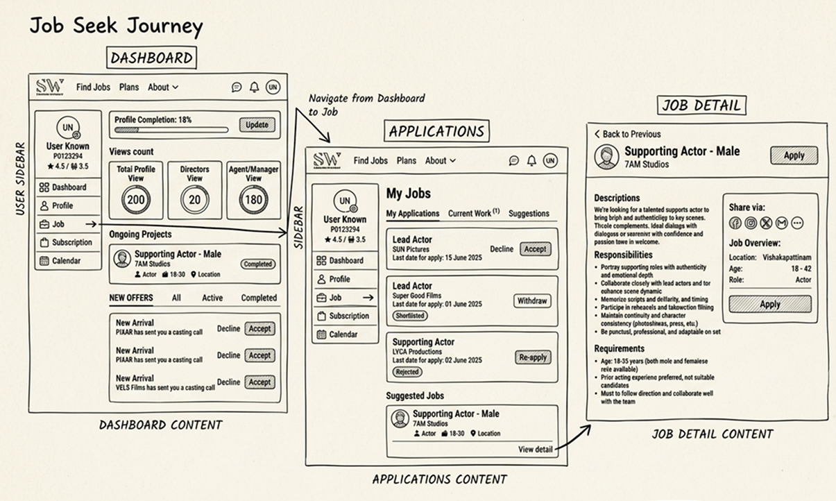
Validated job discovery, application tracking, and project visibility before moving into visual design.
Validating recruitment workflows focused on discovering and hiring suitable talent.
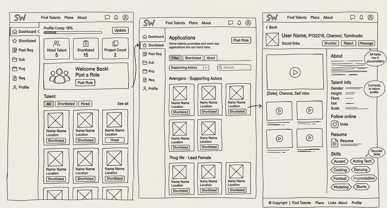
Explored recruiter workflows for discovering, evaluating, and shortlisting talent with minimal navigation.
Designing management workflows for representatives handling multiple talents.
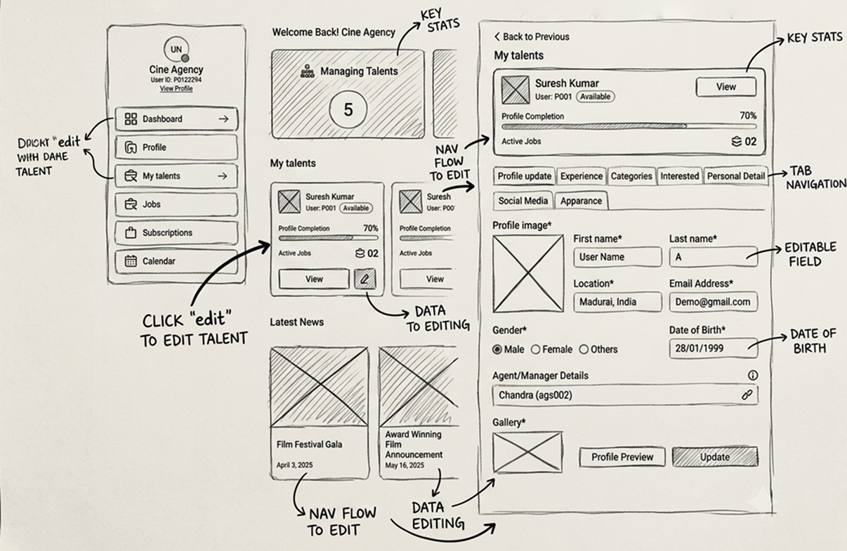
Designed centralized management workflows for representatives handling multiple talent profiles efficiently.
From validated wireframes to polished interfaces, every screen was refined to improve clarity, trust, and usability while preserving business goals.
Reduced onboarding friction through progressive disclosure and simplified information architecture.
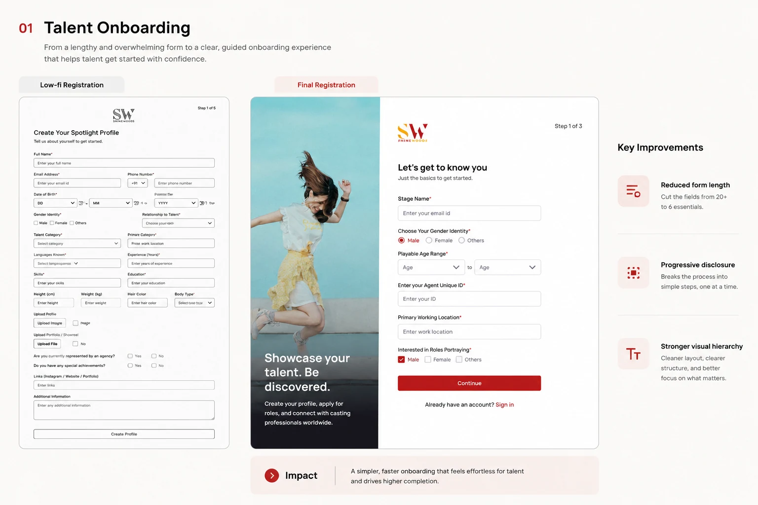
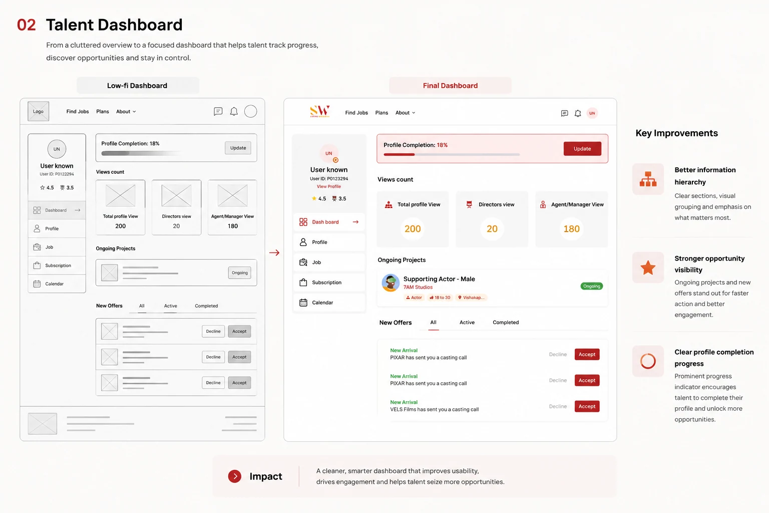
Designed a dashboard that prioritizes opportunities, profile growth, and casting visibility.
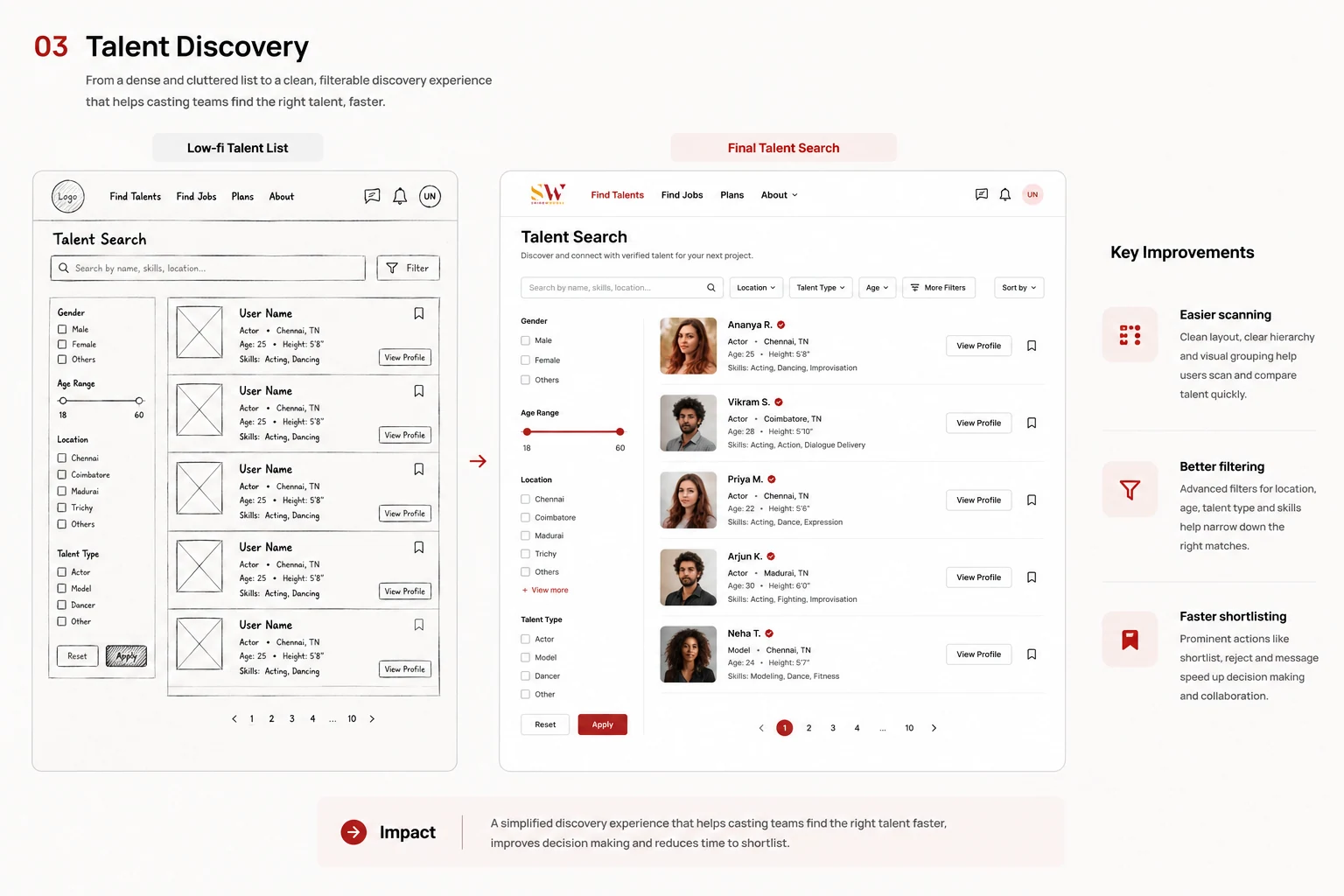
Simplified discovery, evaluation, and hiring workflows for casting professionals.
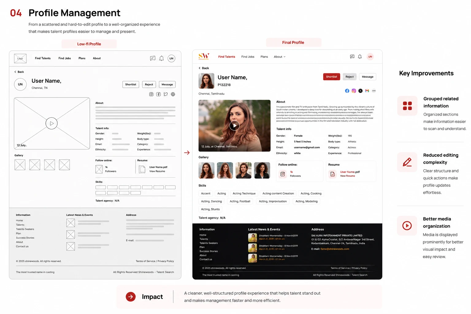
Created scalable management workflows for representatives handling multiple talents simultaneously.
Every interface was intentionally simplified to help users complete critical tasks faster while supporting Shinewoods' business objectives.
A platform designed to support every stage of the casting journey.
The final interface system balances simplicity for first-time users with powerful workflows for talent, recruiters, and representatives. Every screen was refined through iterative feedback while supporting both user needs and business goals.
Designed to reduce registration friction using progressive disclosure, role-aware onboarding and simplified profile creation.
Helping actors discover opportunities, build credibility and manage their professional journey from one dashboard.
Helping recruiters discover, evaluate and manage suitable talent through streamlined hiring workflows.
Built for representatives managing multiple talents across auditions, communication and project coordination.
Every design decision prioritized clarity over complexity, ensuring the platform could scale without sacrificing usability.
Design outcomes beyond the interface.
The redesign focused on improving onboarding clarity, simplifying recruitment workflows, and creating a scalable experience for multiple user groups while aligning with business objectives.
Reduction in onboarding drop-off
Primary user groups unified
Product screens designed
Platform redesign delivered
Design for behavior, not features.
Understanding user goals and motivations produced stronger workflows than simply adding more functionality.
Validate ideas before visual design.
Early wireframes and iterative feedback helped identify usability issues before investing in polished interfaces.
Business success depends on user success.
Balancing recruitment goals with user needs created a platform that was both commercially valuable and easy to use.
Designing clarity over complexity.
Every decision balanced user needs, business goals and long-term scalability, creating a platform that feels simple despite supporting three distinct user groups.
Every project tells a different product story. Continue exploring.
Confidence-Centered Fashion Commerce
Designing trust into fashion purchases through behavioral research.
PayNora
A confidence-first payment experience for senior citizens, shaped by behavioral research and inclusive interaction design.
Sureshbabu Shanmugaraj
Senior UI/UX Designer
Crafted with clarity and intention.